I think aligning the months to the left would make it clearer when it starts and ends.
Sydney said:
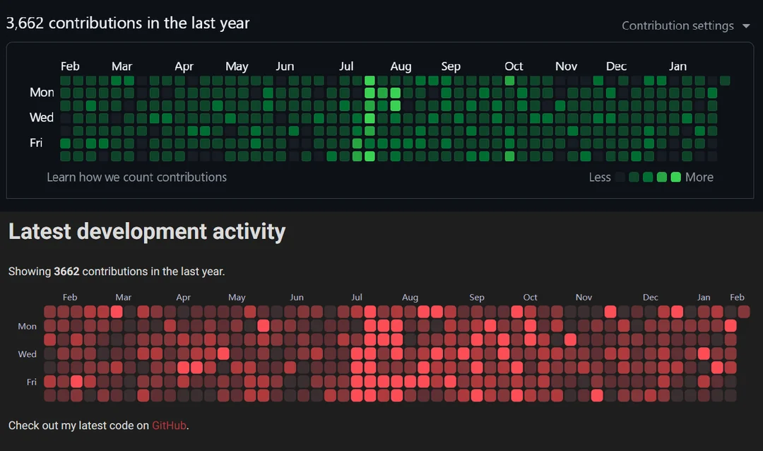
I think aligning the months to the left would make it clearer when it starts and ends.
That’s a good point, thanks! I completely overlooked that when copying the original. I’ll fix that when I get the chance ![]()
Nice work. Maybe one more level for scaling could help highlight contributions in the middle.
Dane said:
Nice work. Maybe one more level for scaling could help highlight contributions in the middle.
Great suggestion! I’m using five colors like GitHub for now, but I can adjust for more or fewer colors. I picked random colors from a color picker, but there might be a more effective way to choose colors that contrast better.
Is that global warming, or were you just super busy in July?
Reeve said:
Is that global warming, or were you just super busy in July?
July is what happens when the project deadline is looming and half the team is on leave ![]()
This looks like Ben10 versus Red Ben10.
I wanted to show the GitHub contribution graph on my personal portfolio website. I found some decent components, but most seemed static and lacked tooltip support. I built my own version with functional tooltips that I think looks pretty nice.
For the tech side, I pull data from GitHub’s GraphQL API since their REST endpoint doesn’t reveal contribution data. The heatmap uses Apache ECharts, which has a fantastic heatmap component. I’ve set it up to resemble GitHub’s graph, aside from some color changes. I also tried a circular dot design, but the square design looked better.
@Noa
That’s a fantastic idea, well done! Also, your portfolio is impressive—very organized and clear. It’s an inspiration as I work on my own.
@Noa
The red color feels ominous. It resembles a pandemic heatmap or robots taking over, or maybe just the number of dependencies added to a project.
The GitHub graph is giving off evil vibes.
I’m guessing there were a lot of small commits in your own projects?
Really cool!
You should think about enabling the activity overview on your profile ![]()
Noor said:
I’m guessing there were a lot of small commits in your own projects?
Really cool!
You should think about enabling the activity overview on your profile ![]()
Yes, most of those commits are from my private repos on my own projects.
I should mention that I have some automated projects that commit to my GitHub account via the API or SSH. For instance, I have a repo that creates a custom IPTV list by combining various lists, which triggers an update commit every three days.
Haha! But is this code available on GitHub?
Cool project! I didn’t know this data was available in the API. I can’t wait to make one for my smart home dashboard.
Can you change the color of those, or does it happen automatically? Red looks cool.